9. Analysis
Analysis provides methods to draw various types of charts from DOE factors and responses as columnar data. Here we can see the multiple charts we can make. We will be using the control charts for our example.
9.1. Chart Types
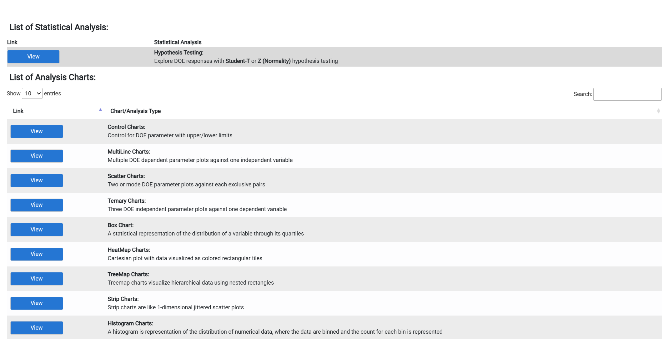
Figure 3.0
Once we access that we click the control chart(s), it will take us to this page.
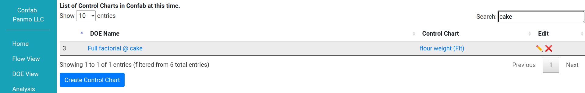
Figure 3.1
This leads us to the following page. You will choose from the DOEs you have made. The Xaxis will track what is vertical line on a graph. Where the Yaxis will track the the horizontal line on a graph. The Lcl is the lower limit control and Ucl is the upper limit control. This will control the view into your chart.
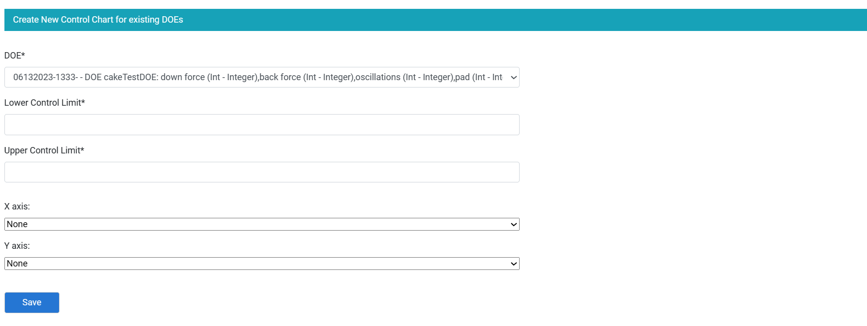
Figure 3.2
9.2. Control Chart
Then you would save and click the control chart after the DOE name. For our example it says flour weight (FIt). That will pull up your control chart that will look like the following.
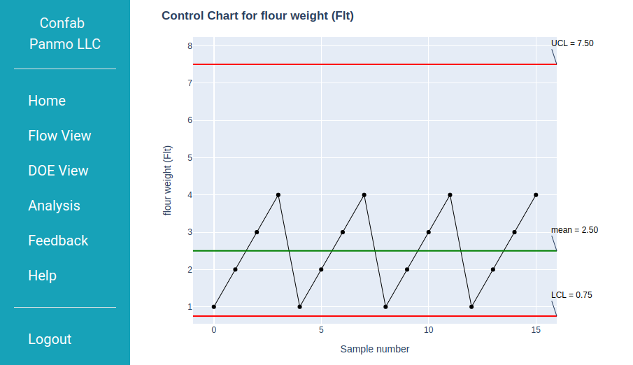
Figure 3.3